Client:
Amedia
Agency:
Maverix
Services:
Graphic Design
Visual Identity
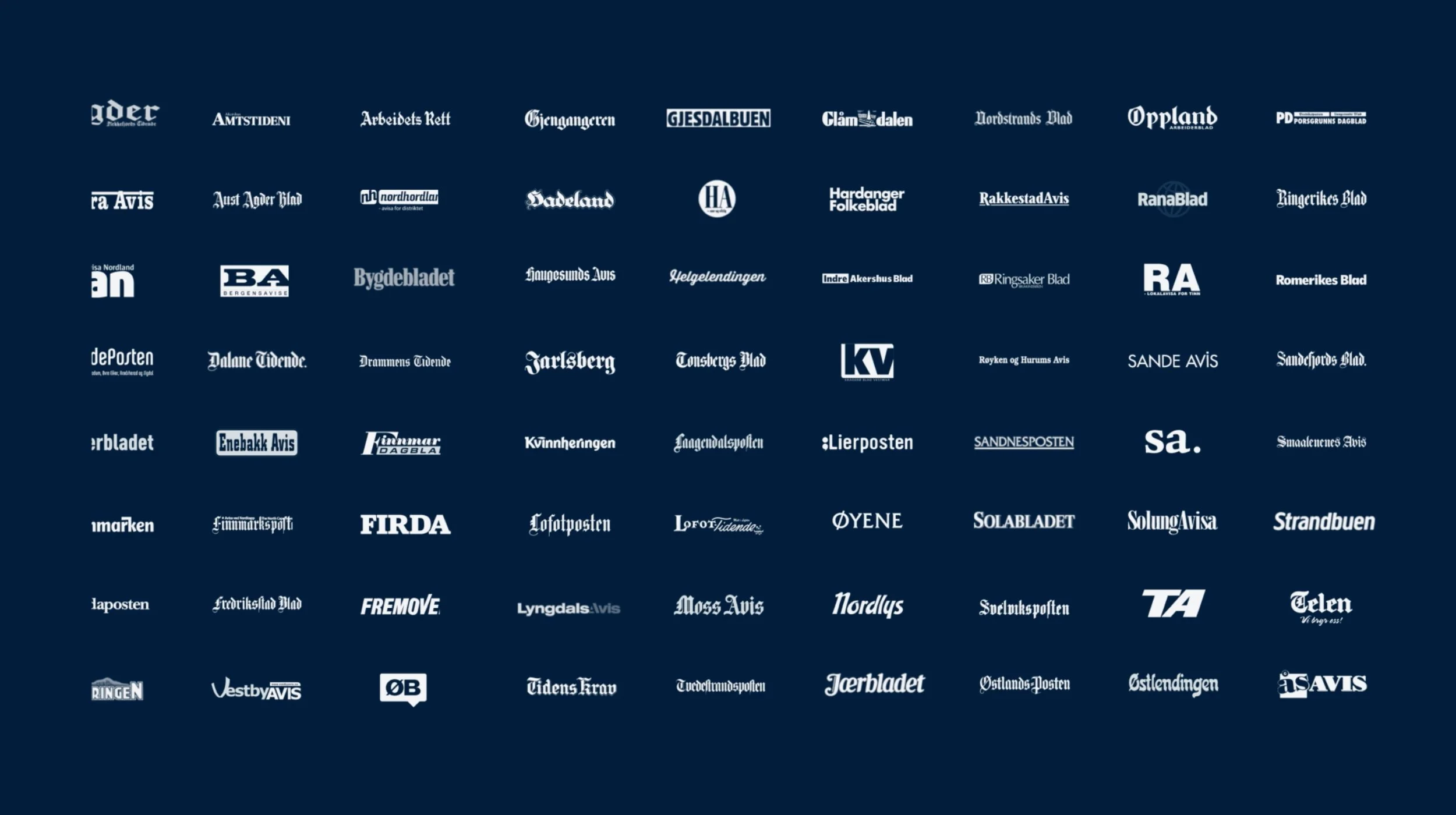
Unified identity across 72 local newspapers
Rood Design collaborated with Maverix to create the visual identity for Direktesport, a shared streaming platform built on top of Amedia's network of 72 local newspapers, broadcasting up to 6,000 matches and live events a year.
The brief was rooted in plurality. Each of the 72 local editorial teams carried its own logo, many unchanged for decades and fiercely defended as local identity. The task was not to replace that heritage, but to build a shared system flexible enough for every newsroom to make genuinely its own.
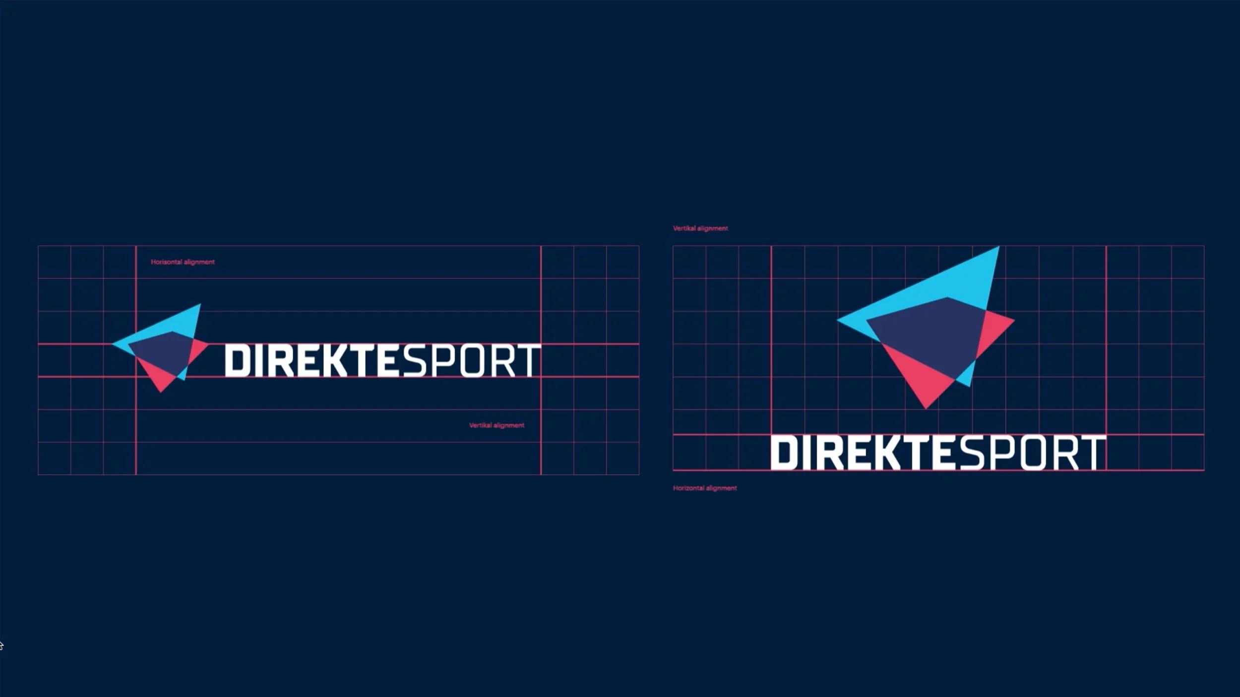
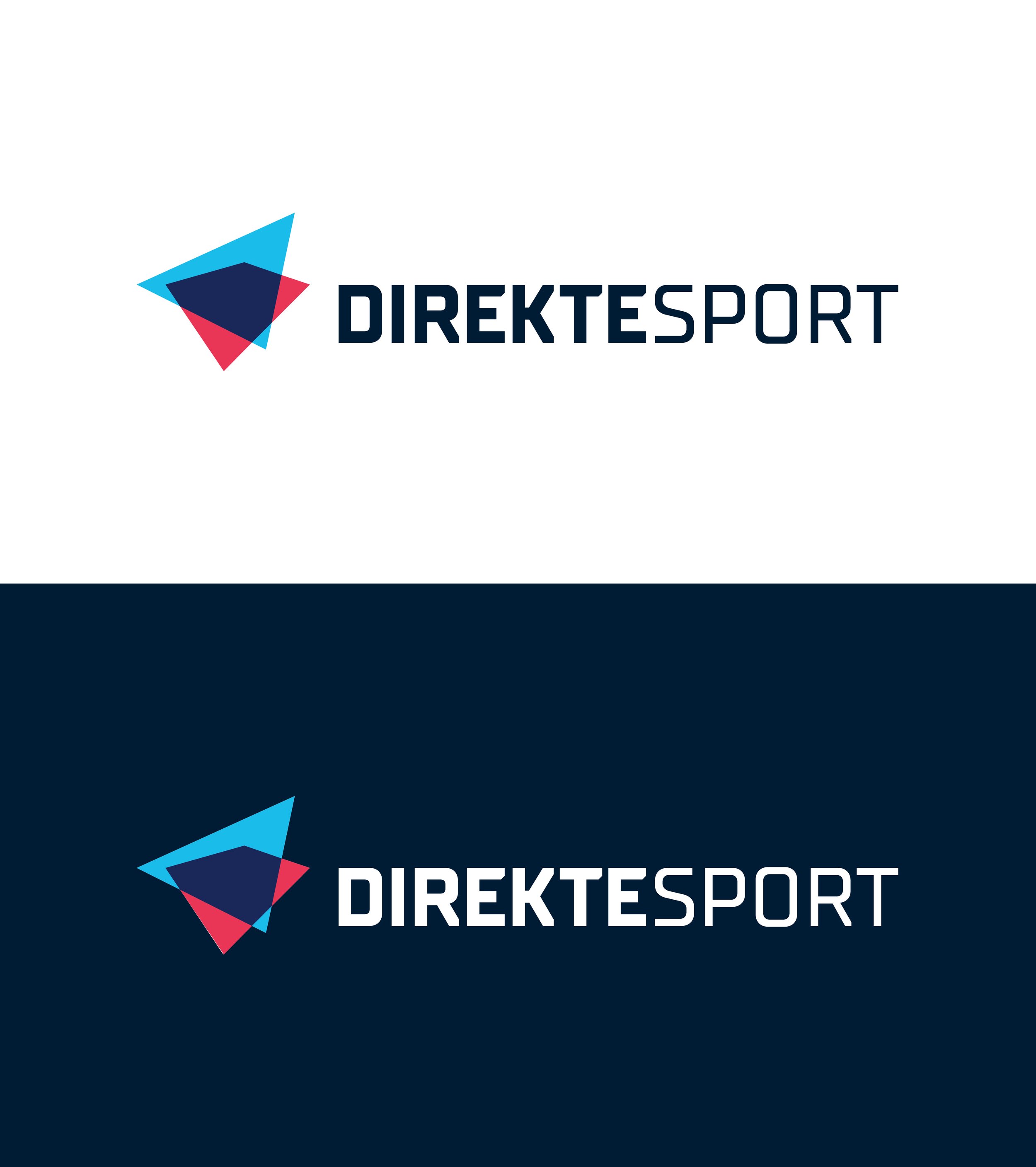
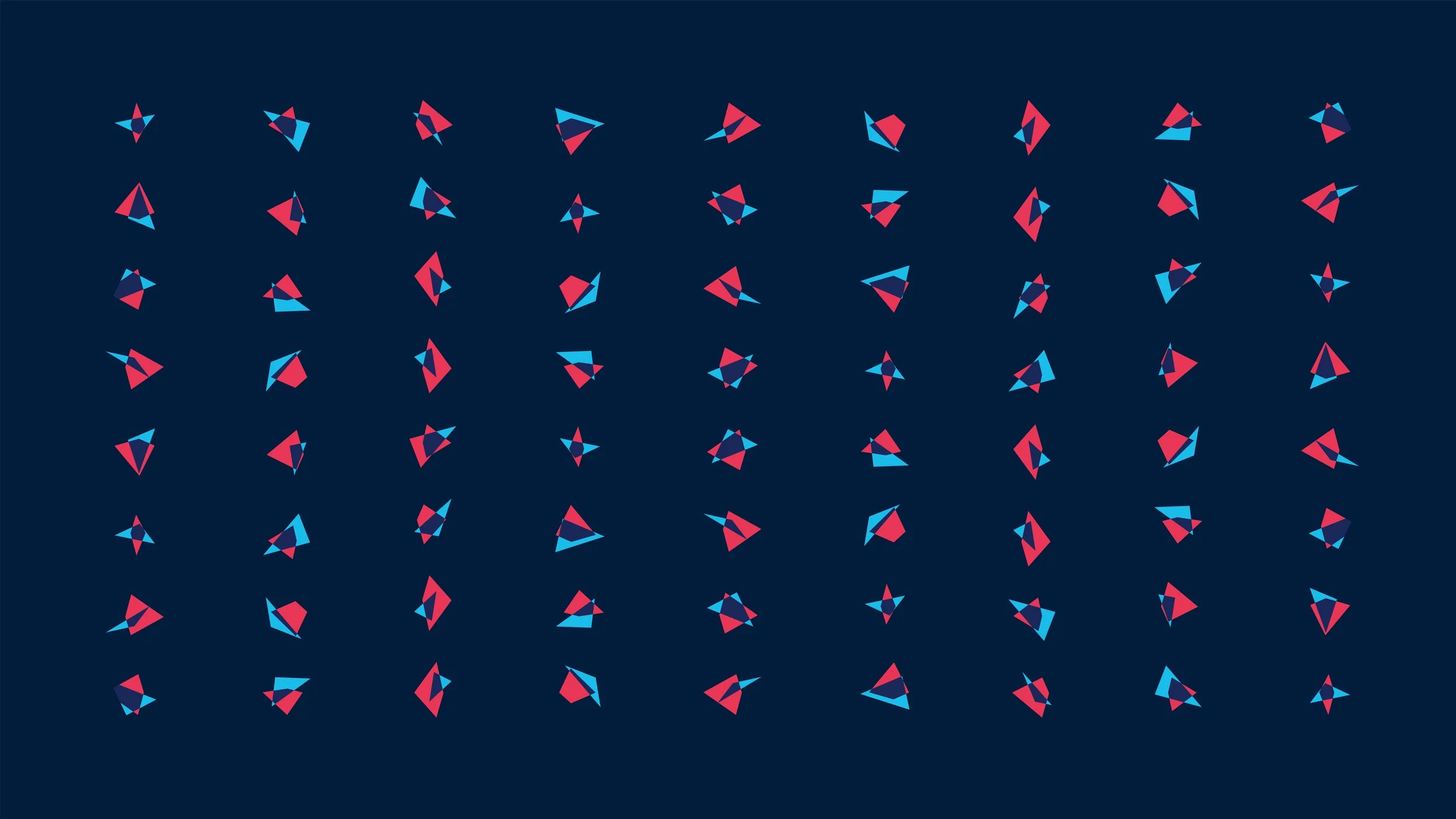
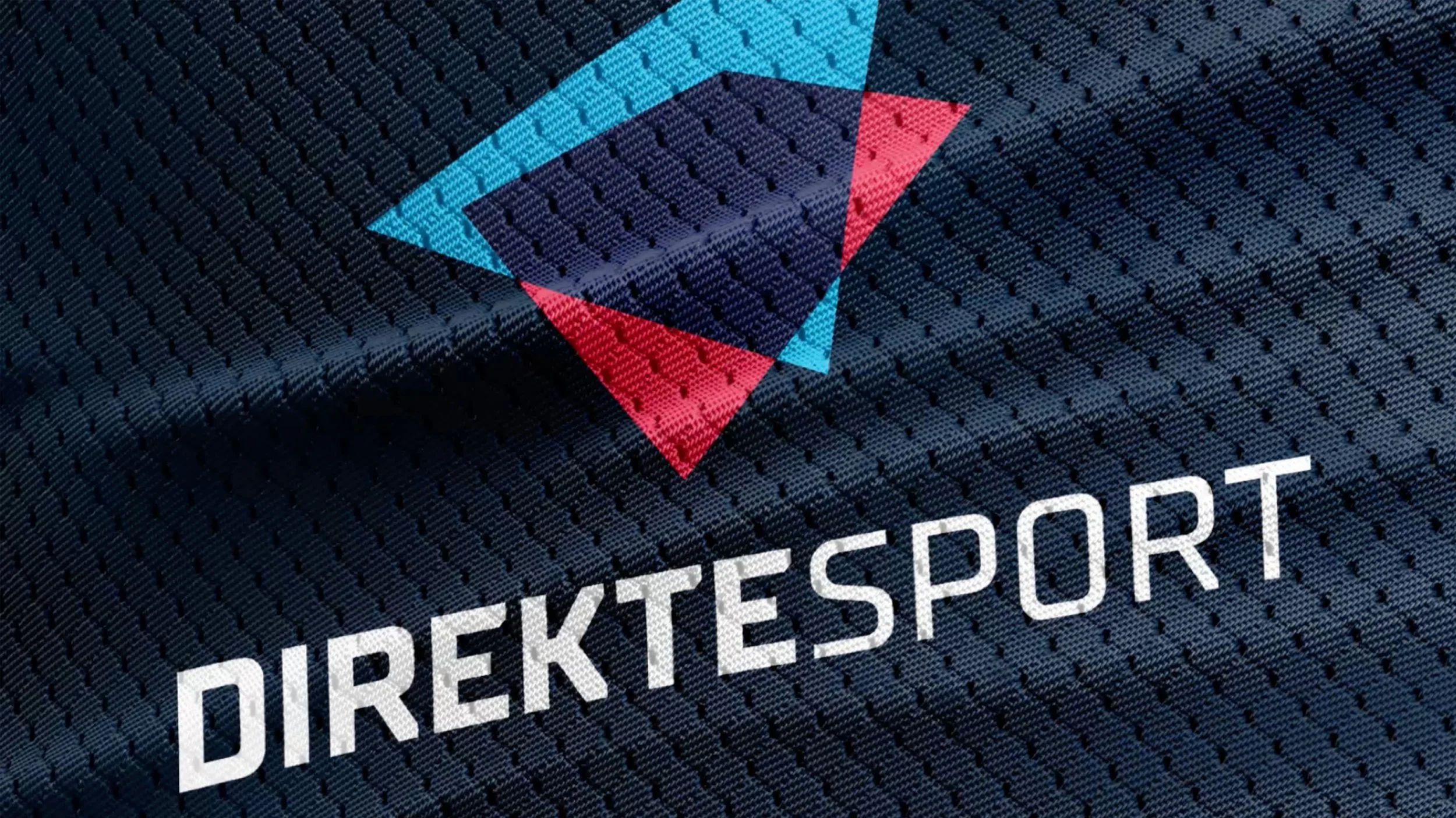
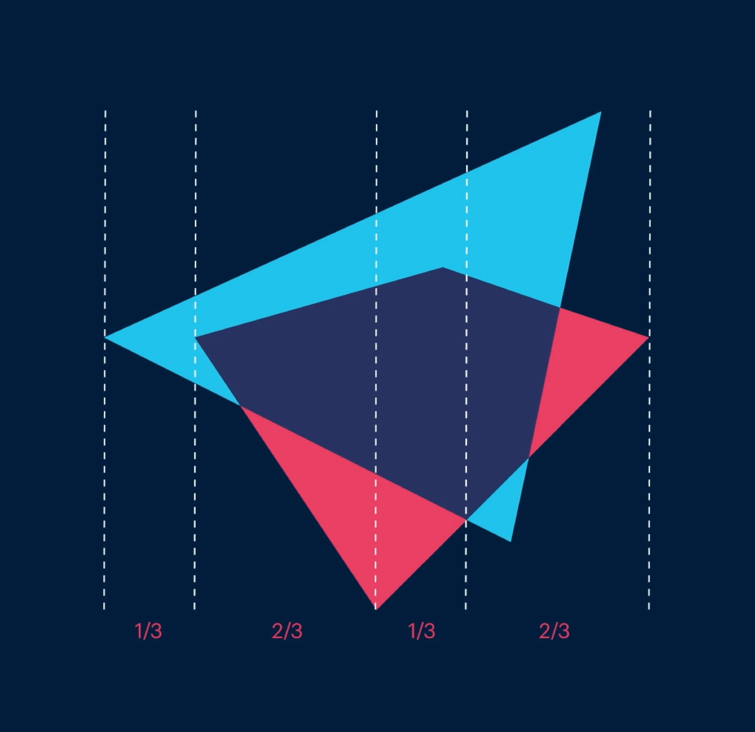
The solution was a single core mark, built from three overlapping triangles in red, blue, and navy, forming a faceted play-button shape, paired with a modular system for generating a dedicated version of that mark for each of the 72 newspapers. Rather than one fixed logo applied uniformly everywhere, the geometry stayed constant while each local edition received its own variant, giving every newsroom a Direktesport logo that was visibly theirs while remaining unmistakably part of the same family.
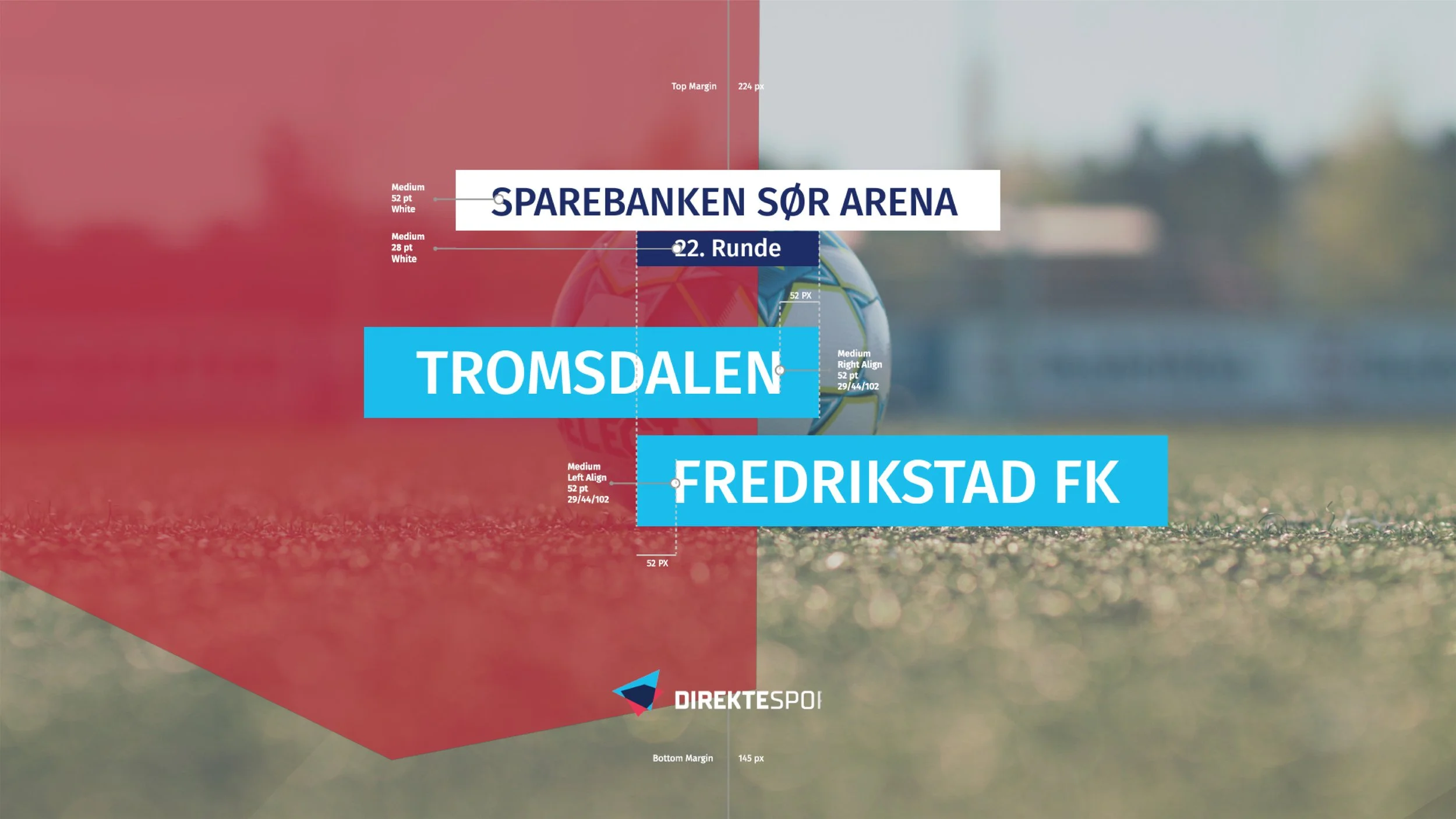
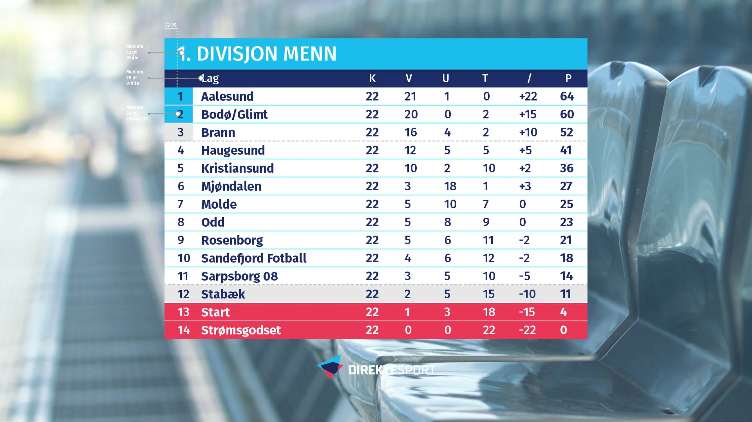
That same triangulated geometry carries through the rest of the system. Broadcast graphics, scoreboards, and team-sheet overlays are all built from sharp, angled panels rather than soft boxes, giving every piece of content the same visual rhythm regardless of which local team or sport it covers. The colour palette stays disciplined throughout, navy as the dominant ground, red and sky blue as the accents that carry score data, team names, and live information clearly over any pitch or arena footage.
The result is a platform that scales from a single local match to thousands of fixtures a year, and from one shared mark to 72 local ones: recognisable as Direktesport everywhere, and worn by each newsroom as something that genuinely belongs to them.