Client:
Skjoldr
Agency:
Core Agency
Services:
Concept Design
Graphic Design
Visual Identity
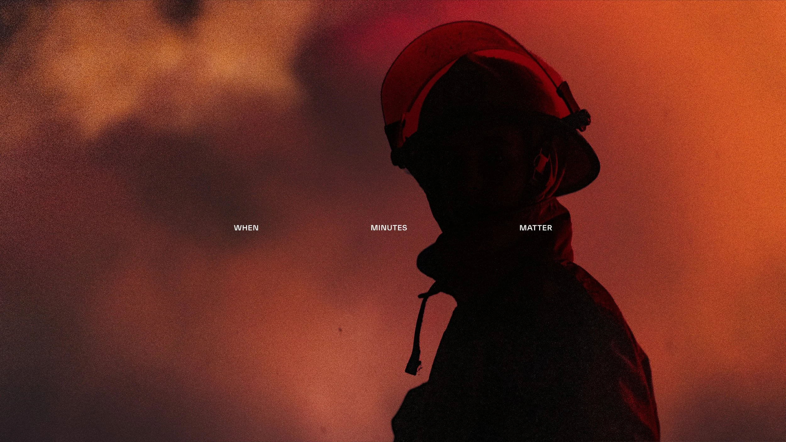
Building a brand for first response
Rood Design collaborated with Core Agency to create the visual identity for Skjoldr, a brand built around the urgency and precision of first response, requiring a mark and system that could communicate readiness, authority, and trust from the first encounter.
The name carries its meaning from the source. Skjoldr comes from Old Norse, where the word means protection and shield, and appears in Norse legend as a king and ancestor of the Skjöldung dynasty. That heritage is not decorative: it anchors the brand in something older than the company itself, connecting the modern mission of protection to a word that has carried the same weight for a thousand years.
The symbol makes that lineage visual without resorting to literal Viking iconography. Two runic forms, the Norse letters S and R, are combined and mirrored into a single shield-like mark. The geometry is angular and deliberate, with the structural logic of runes translated into a contemporary icon that holds its own at any scale. The tagline, When minutes matter, the first response decides the outcome, sets the stakes plainly.
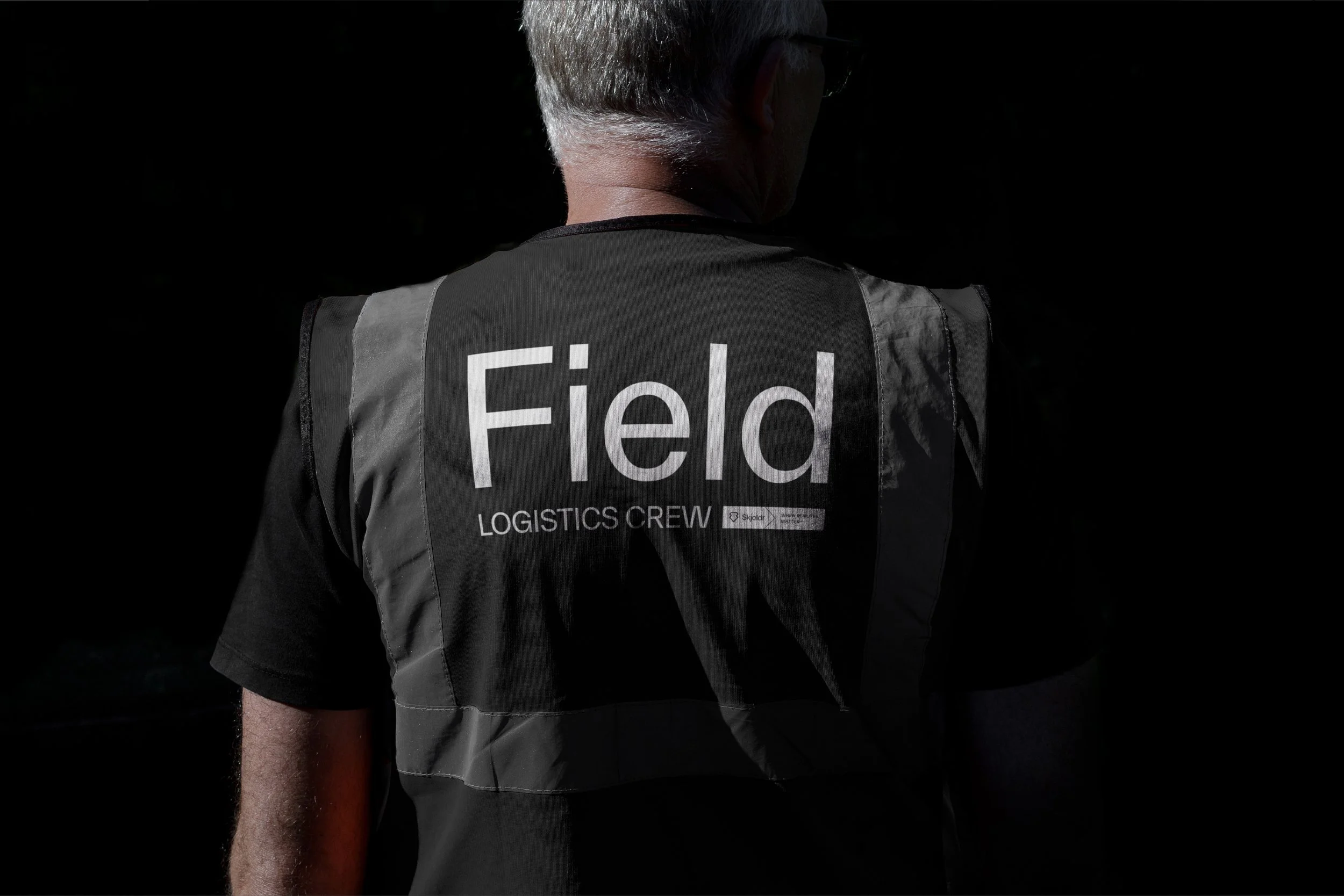
The colour system runs across three modes: a sharp electric yellow for maximum visibility and urgency, a deep black for authority and precision, and a cool light grey for clean, functional applications. Each works independently and together they give the identity range without losing coherence.
The result is a brand with genuine depth: rooted in heritage, built for modern use, and sharp enough to hold attention in the moments that count most. What started as a name is now a brand with genuine depth: rooted in heritage, built for modern use, and sharp enough to hold attention in the moments that count most. Skjoldr has the foundation and the platform to build on as the company grows.