Client:
Flamingo Café
Agency:
Rood Design
Services:
Graphic Design
Menu identity built from its own name
Rood Design developed the visual identity for Flamingo Café, a newcomer to the café scene in Stavanger, requiring a brand presence built around something as simple and memorable as its own name.
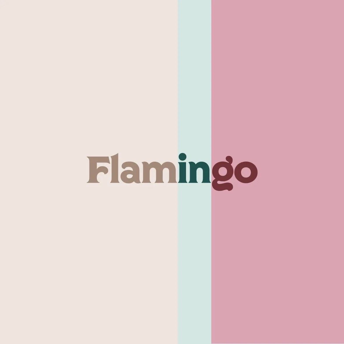
The identity centers on a modified version of the font Regina Black, reshaped to carry the café's personality across signage, packaging, and everyday print material. Rather than treating the wordmark as a static logo, the name itself was put to work as a functional design element.
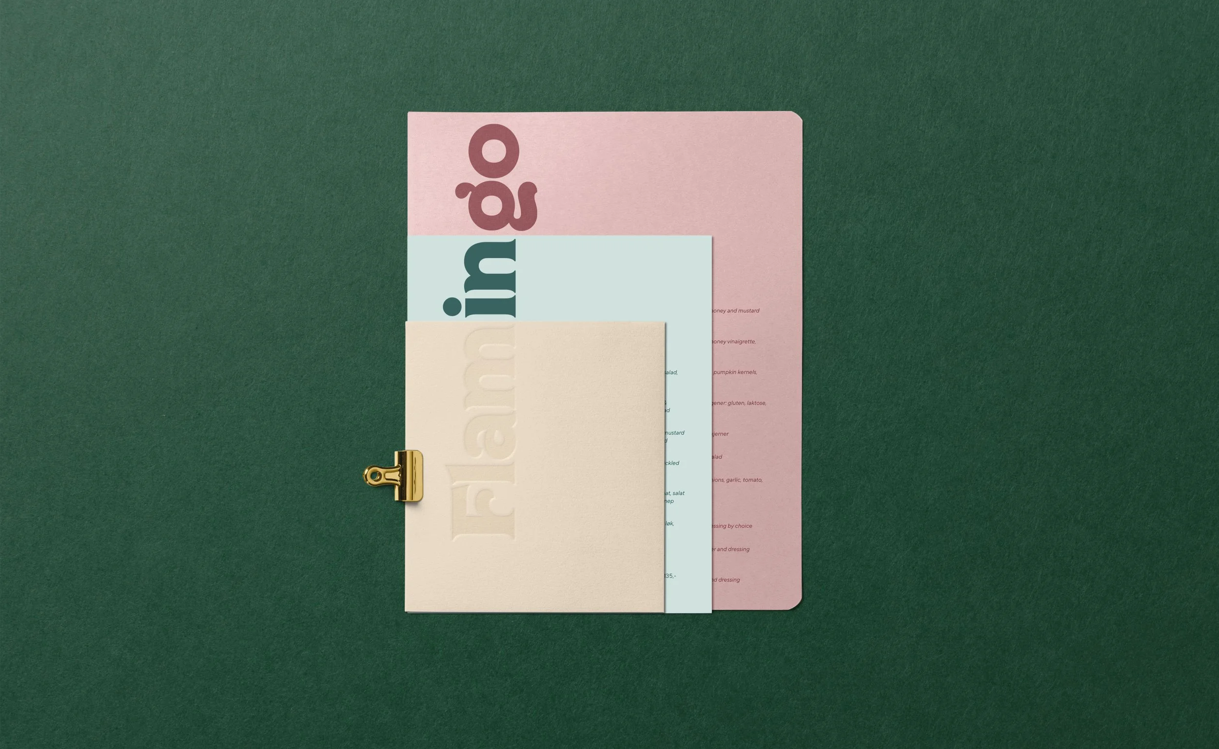
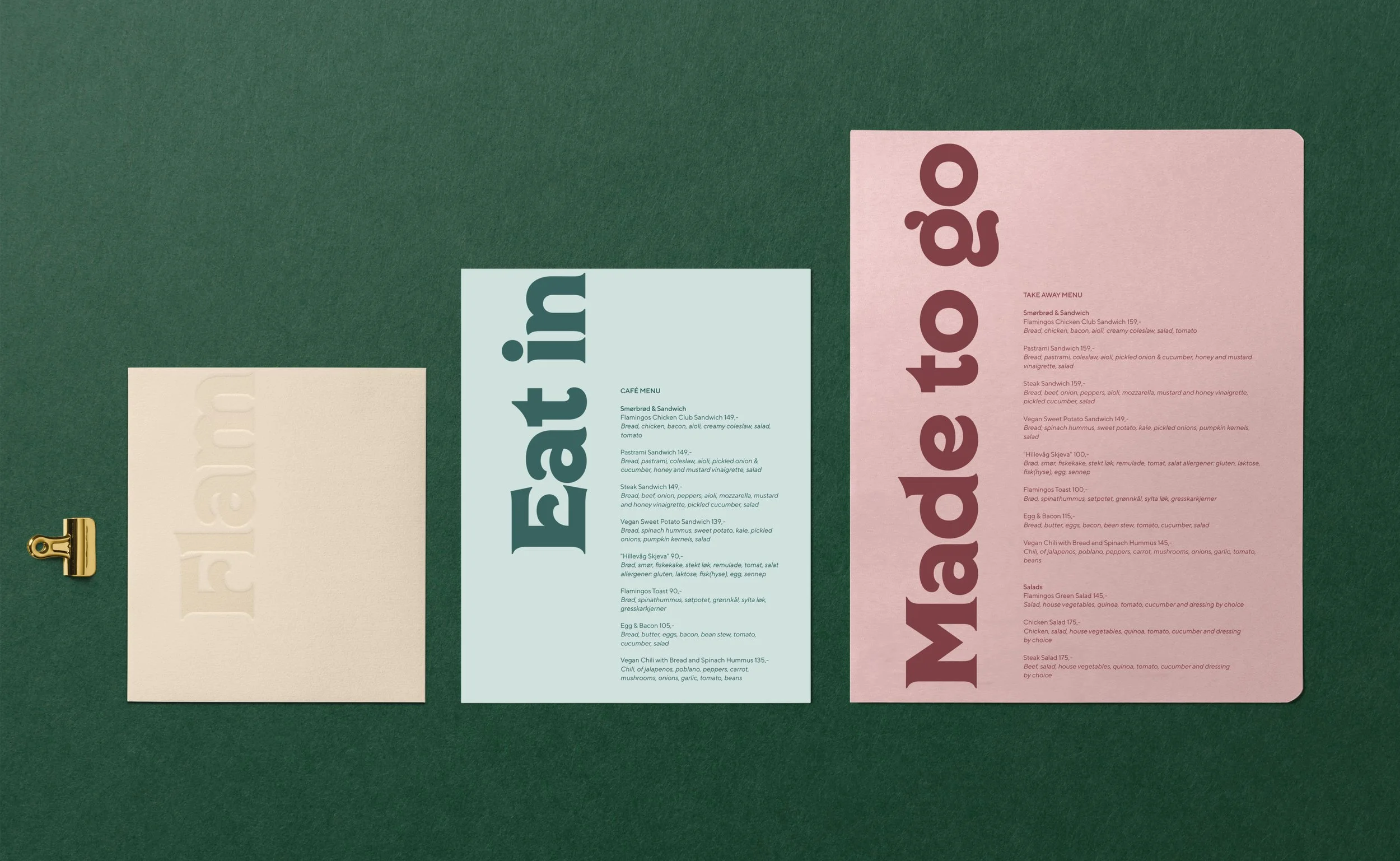
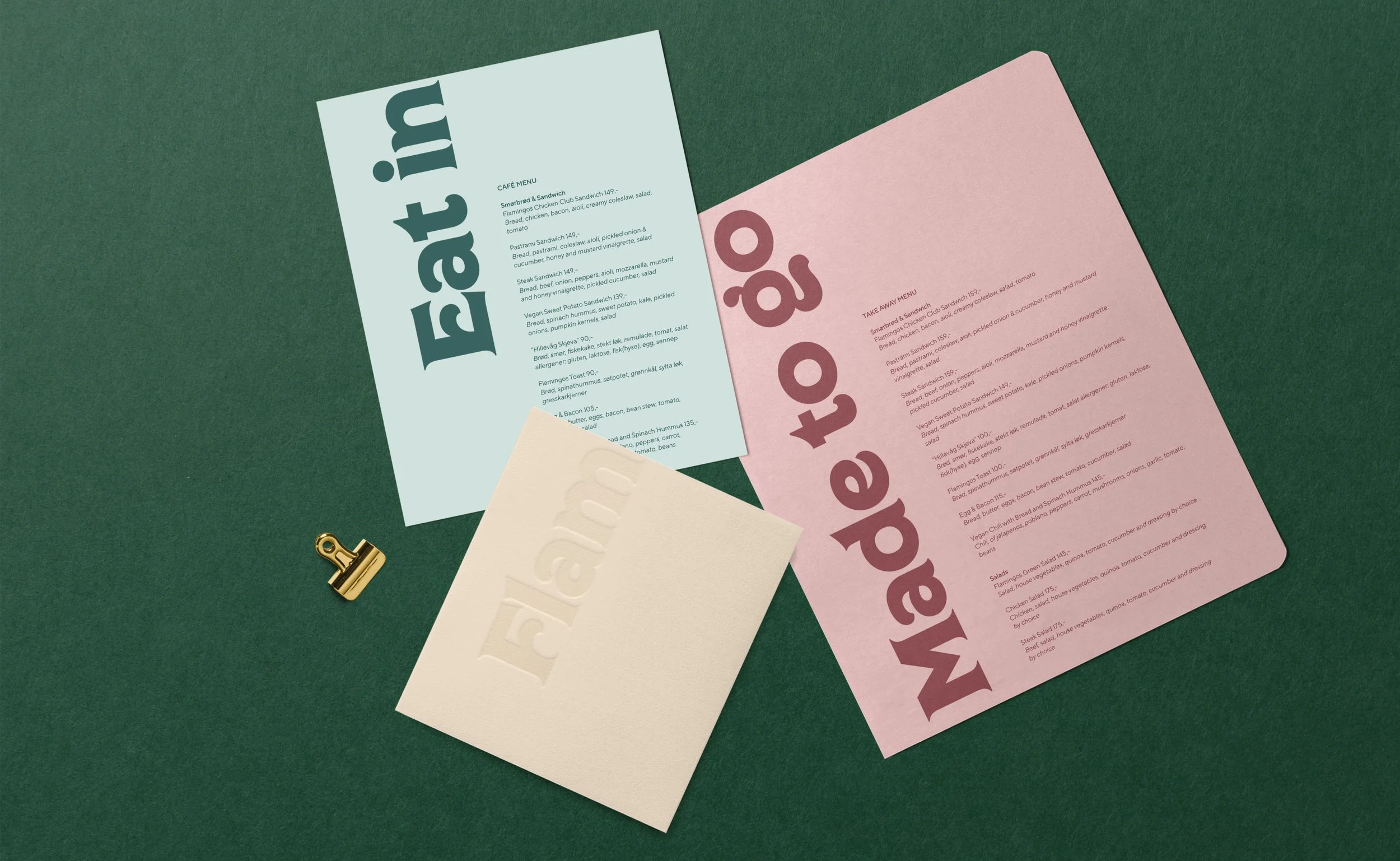
The menu system reflects this directly. Instead of one combined menu, Flamingo's offering is split into three separate pieces: Eat In for indoor dining, Made to Go for takeaway, and Flam, a short introduction to the café itself. Read together, the three names spell out Flamingo, turning a practical need to separate dining formats into the clearest expression of the brand's identity.
The result is a system where structure and storytelling are the same thing: customers encounter the name in pieces before they ever see it whole, and the act of choosing a menu becomes part of discovering the café's identity.